Wednesday, 20 April 2011

G321 Evaluation: Comparing the Preliminary Task to Our Final Opening

Looking back at my preliminary task, what do I feel I have learnt in the progression from it to the full product?

In the preliminary task, our task was to create a short film demonstrating match-on-action, the 180 degree rule and shot-reverse-shot through someone walking through a door and a conversation between two people. I was with a different group at the time and we decided to be as imaginative as possible within the brief set and so decided on a dream storyline. This main task, however, was to create an opening for a film of a genre of our choice. Though this gave us a lot more freedom than the preliminary task as to the plot and content of our piece, it also restricted us to a specific style of film as it was important we did not create a trailer or use conventions from another genre. There was also a lot more planning into the locations of filming, characters, costume and camera angles for our final piece and this was a lot more work, often distracting us from what we had learned in the preliminary task (180 degree rule, etc). 
Preliminary Task
Match on Action 1
Preliminary Task
Match on Action 2


Preliminary Task
SHOT
180 degree rule
  
Preliminary Task
REVERSE
180 degree rule
Preliminary Task
SHOT
180 degree rule


Our overall product for our film opening is also a lot more complex than the preliminary I created with my other group with more advanced editing techniques, such as the multiple split screens and quicker paced editing. We were also a lot more creative with our ideas, specifically with the "Wisecrack Studios" logo where we used real footage and a banner in comparison to simple, coloured text and transitions on the screen as with our preliminary task. Feedback from our preliminary task included that the storyline was not totally clear and so with our opening, we used multiple split screens and the final long shot of the boys walking together down the road in order to clarify our opening to the audience.


The logo of our institution from our comedy opening in comparison to the slogan the end of the preliminary task is a lot more creative and and humour reflects the comedy genre more than if we used plain credits:
Being creative with our institution logo


Learning from our preliminary task suggested made us ensure that the storyline was clear and so we used this split screen and long shot to differentiate the characters:
The Final Split Screen in our Opening 
The Final Long Shot of our Opening

As mentioned before, the planning and research into the comedy genre, other comedy openings and preparation for filming, such as locations, costumes, props, etc, was extensive in comparison the the preliminary task but necessary. It enabled us to be prepared for filming so that we completed the opening on time and ensured that we produced an opening for a comedy film and not a trailer. The research and planning also helped with choosing the genre to start with by looking at other media texts, as well as creating ideas in regards to characters by looking at others of similar films (Superbad, 2007). The storyboard, shot list and animatic storyboard also helped us to be efficient and quick at editing and filming our piece as we knew what to film and which order to edit the footage in. Without the planning we wouldn't have been able to have the time management we did or have time left over to film extra shots that we felt were necessary to be re-filmed. 

Since the preliminary task, our use of shots has improved though we did not incorporate any match-on-action or shot-reverse-shot. The steadiness of our shots has also improved so that we do not need to stabilise our footage. An example of this is the backwards tracking shot from the preliminary task and the final shot of the opening of a tilt towards the sky. Since I filmed both of these shots, I can see my improved skills I have developed over the past few months. The following shots are of where the camera's focus has been altered in order to correct the shaking camera. This is in comparison the tilt from the comedy opening in which the camera is steady and smooth.

A screen shot of the pan from the first, rough cut

Preliminary Task
Preliminary Task


Preliminary Task
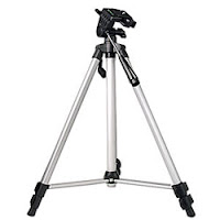
The cameras we used for our final opening were the same ones as those we used in our preliminary task, our remakes of Juno, The Strangers and Vertigo. Though they do not have high definition, they were sufficient enough to create our opening with various settings for different light conditions and focus pulls. If we filmed in high definition, it would have made our opening look more professional and like the mainstream film we set out to create. We also used the same tripods as our preliminary task and so we were fully aware how to use them the level on the side to ensure the shots were straight. However, the dolly we used in the preliminary task caused problems with shaking and wobbling when it was not on smooth surfaces. Because of the problems we faced with shaking and blurring when stabilising the shots, we decided not to use a dolly for our comedy opening. This removed the hassle of finding smooth surfaces to film on but also limited the shots we could use. To compensate, we directed the characters to move towards us and used other shots, such as pans and tilts, to create movement in our piece. 
 We also changed the editing software we used when creating our comedy opening in order to create a more professional product. For the preliminary task, we used iMovie - the standard editing programme available with the Mac. Since I already knew how to use this programme, it was easy to teach other group members how to use it and this saved time editing our work. However, iMovie was limited to the editing techniques and the variety of titles and positioning of them and, as a group, we also wanted a challenge. We decided to use Final Cut Express to edit our comedy opening enabling us to create more complex shots and make our film look more professional. Unfortunately, we underestimated how complicated the software was and spent several hours trying to figure out basic editing procedures and this wasted a lot of time when editing. In hindsight, I would still use this programme as I believe it helped us to create a better opening and achieve the best results.

The comedy opening fulfils the task set as it's definitely an opening and lasts nearly two minutes. As an audience, you can see this through the known conventions of an opening; the plot is not revealed; there are few, if any, fade-to-blacks and that the narrative is open. The title is also situated at the start of the film, with the correct titles and order of the comedy genre. It also conforms to the conventions of comedy, making the audience laugh or feel amused.

Since the preliminary task, I have learned exactly how the camera equipment and tripods work allowing me to save time when setting up equipment and filming. The level on the tripod also enabled us to create a better quality product than if we hadn't used a tripod, as well as the different focus and lighting settings on the camera. The past two tasks have also improved my communication and organisation skills with my group members as it was essential for us to meet the deadlines necessary so that we didn't get caught up in our work and other subjects. I have learned discipline in myself to ensure that I meet the deadlines, not just for myself but for my group members, and that pushing yourself that bit further will help you achieve the results in your film that you want.

Monday, 4 April 2011

G321 Evaluation: Learning About Technology


What have we learnt about technologies from the process of constructing our product?

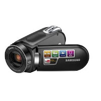
The camera we used was the Samsung 42 Intelli Zoom which does not have high definition filming and a lower pixel resolution compared to the cameras used for professional film, such as a SONY Canon XL High definition camcorder. There are also limited options for lighting and focus for the camera, as well as a smaller screen. However, this was sufficient for us to capture the shots necessary but not to the highest quality we desired. We did face issues with the automatic focus pull but after a change of the settings, these were corrected quickly. Also, as all the shots we used in our piece were supposed to be steady, we needed a Tripod to avoid shaking the camera and prevent as much focus blur as we could when the camera panned or tilted. It enhanced our film as it's very difficult to hand-hold a camera when doing a steady shot and saved us a lot of time when filming our shots. 


One problem we faced constantly during filming was the changes in lighting. As we filmed over numerous days and in various locations, the weather changed and caused the shots to change in brightness when they were supposed to all be around the same time of day. When filming Stacey, the bright sun, angle of the shot and Stacey's costume caused her to virtually disappear on camera and so we had to use a different door at the same location with darker, low key lighting. This took up time and made filming a bit longer than it needed to be as we had to create a solution. Also, when filming the shot for Stacey with the alarm clock, it was very difficult to time it so that the camera panned to the clock just before it went off. This took several times and we had to reset the clock and count in until we got it right. We also filmed things in different orders and for some shots, Stacey had her pyjamas on or her day clothes when she should be wearing the other costume. As we didn't realise until editing, we had to swap around the shots which made it difficult to follow our storyboard and correct the errors. Next time, I will make sure I pay attention to the mise whilst filming so that these problems can be avoided.


Originally, Stacey was to be wearing her pyjamas still when reading her book in the split screen, as seen in her first shot. However, because of the order we filmed in we didn't concentrate on her costume and had to switch the shots around to ensure we kept the continuity. 


Like Stacey, there were also issues filming Bob. Since the original location planned was not totally suitable for filming because of the space, we had to use a different room in the same location. However, problems then arose due to the lighting. The first set of shots were dark and orange due to the artificial lighting and these were not correctable on the Mac so we had to film them all again a different day. We opened the blind a bit and turned off the lights resulting in brighter shots, with natural lighting. The actor also did not feel comfortable wearing boxers in front of the camera and so we compromised by allowing him to wear pyjama bottoms.


To challenge us, our group decided to use Final Cut Express rather than iMovie which enabled us to create the complex shots we needed, such as the various split screens. It also allowed us to be more precise with our editing and take the exact clips we wanted for our film. It helped me to learn that editing can be overcomplicated if the plot is unnecessarily complex and that storyboards are important in order to edit quickly and efficiently. In the future and if I had to do this task again, I would try to create a more simpler opening to prevent getting confused when editing.


As a group we worked well together. We split the work between each person fairly and nominated ourselves to do different bits of work as we also had to be weary of other subjects. However, problems did occur when some group members missed several lessons and editing sessions causing us to struggle to keep up with group blog work. The editing work became uneven between group members as some stayed after school and edited during free lessons so that we could meet the rough cut and final cut deadlines, whilst others did not. Though this did cause problems, we managed to finish the work on time and to the best standard we could.


Using blogger was an effective way to record our work and progress throughout the whole process. It prevented us from carrying around and potentially losing paper work and was quicker than writing. It also enabled us to add links and use footage and images in order to express our opinions and present our ideas and research was also easier to do as we could go onto Youtube and use clips from there to analyse. However, problems did occur when the site would crash or if the internet was unavailable as it would delay our work and put us behind when trying to meet deadlines. It was also confusing as to which posts should go on our individual or our group blog.

Wednesday, 30 March 2011

Monday, 28 March 2011

Sunday, 27 March 2011

G321 Evaluation: Distribution of Our Film

      
The 3 main characters of
our film
What kind of media institution might distribute our product and why? 

Our film is a mainstream production aimed at a mass audience which could be produced by or associated with Hollywood and released globally on DVD or Blue Ray. A product similar to ours is Superbad (2007) distributed by Columbia Pictures. This is a well known, American institution in Hollywood which has also produced and distributed films such as Spider-Man (2002), Casino Royale (2006) and The Pursuit of Happyness (2006). These are mainstream films aimed at large audiences with famous actors such as Will Smith or are based on already popular subjects, such as comics or the character of 'James Bond'. With these qualities, Columbia Pictures is able to reach larger audiences and gain more profit. Also, with their status in the film industry, they can also use social networks, like Facebook, and teaser trailers in order to create interest in the media. Since Superbad has comparable characters, themes, actors and a similar plot of trying to win a girl, it can be suggested that our product has the potential to be released into Hollywood for a mass, global audience. Films like Superbad are also for entertainment purposes and a passive audience, like our film, so we can assume that there is room in Hollywood for our product and that interest would be created.

The character of Superbad are
comparable to the characters from
our film
When an institution decides to distribute a film, they create a strategy or plan of how, who with and for, when and where the film will be promoted. The company then creates various marketing campaigns and promotions as well as organising any partnerships for funding and marketing before checking for accountability. An institution, like Columbia, that would distribute our film would be Universal, Warner Bros or Paramount Pictures. These are also large, mainstream institutions which distribute films aimed at mass audiences to main multiplexes and, furthermore, can afford blanket releases. This would allow a wider, mainstream audience to be reached at one time and decrease the public's need of faster DVD release. Vertical and horizontal integration with other companies in the media sectors would also allow a wider variety of distribution ensuring that our target market of teens and young adults were reached in as many ways as possible. 

One of the posters from The Dark
Knight campaign
An example of how integration and cross-media convergence could be useful is the film The Dark Knight (2008), distributed by Warner Bros. Warner Bros produces, on average, 18 - 22 low-risk films per year and with a budget of $185 million, worldwide distribution rights and horizontal integration with DC Comics and Marvel, they had extensive access to a variety of media and the audience targeted for The Dark Knight. They used teaser trailers, Facebook advertisements, Myspace, a poster campaign, interviews with Entertainment Weekly and viral websites in order to create interest for the film and ensure the target market had been reached. Warner Bros also used IMAX equipment for some of their action scenes instead of the standard 35mm reels and this increased interest as to the special effects and overall quality of the film. The Dark Knight gathered $395 million within the first three weeks of release. If our film had the same access to these medias and distribution methods, we could gain a larger interest into our film and ensure that our target audience was reached.


However, our film could be funded and distributed by Working Title, a conglomerate to Universal. Even though we would be under the control of Working Title, any budgets and marketing would be sourced from Universal. Their status in the film industry would allow global distribution and expensive marketing campaigns, such as a collection of posters or cross-media convergence with Facebook advertisements in order for us to reach our target audience. It would also ensure quicker DVD release reducing the potential risk of piracy. 


However, our film has little potential for franchising and merchandising. DVD release would be the main source of income after cinema release, as well as bonus features and materials. However, our film could be distributed in stores such as Blockbuster and HMV or online on Amazon and iTunes. These are popular stores in the UK and globally ensuring that any consumers who wished to buy the film could. With a more adult target market (15 to 25 year olds), there is little in the way of merchandising except for t-shirts and posters with the characters and iconic catchphrases from the film. Because of our film is of the comedy genre, any merchandising created will include bright colours with fun font styles and images. 


Buying films on iTunes and the Internet has become
easier over the past few years


G321 Evaluation: Representation of Social Groups

How does our media product represent particular social groups?

These are the representations I felt were most important to our opening:


These are the representations I felt were not as important as age, gender and social class but were still incorporated into our opening:

Saturday, 26 March 2011

G321 Evaluation: Challenging Comedy Film Conventions

In what ways does our media product use, develop or challenge forms and conventions of real media products? 

The comedy genre is known to evoke humour and laughter within its audience through amusing subjects or characters. It's enjoyed globally but specific humour is received better in some countries more than others. For example, the US is known for its exaggerated comedy and sterotypical characters (as seen in The Other Guys, 2010) while the UK is known for its sarcasm and social realism to create humour (demonstrated in Anuvahood, 2011). Generally, comedy is made for entertainment purposes for an audience and will use the Hypodermic needle Theory to engage them. To prevent young people copying the behaviour and language seen our film, we rated it a 15. 


As established in a previous post, there are two main types of comedy; comedy that's comedian-led with well-timed jokes or gags and situation-comedies which create humour through the narrative and order in which events occur. These often overlap. As mentioned in a previous post, comedy can also be subdivided into slapstick, back/dark comedy, parodies and satire comedy. They can also be put into several groups such as teen comedy, romantic comedy, social comedy and gross-out comedy. Our film is a teen comedy with obvious British humour since our characters and plot reflects social realism. It's also set in a college with teenage characters fighting to be the most popular and win the girl, including sexual themes. Since some of the themes and characters are laughable when they shouldn't be, it could also be regarded at black comedy to some extent. Elements important to comedy include:

Timing and Performances: Both of these elements must work effectively together in order to gain the desired result; laughter. Developed and interesting characters are needed in order to create interest amongst the audience and a good script and well thought-out narrative are needed in order to make the best of these characters. However, depending on the country or region of an area, humour varies from person to person. Though it would be globally distributed, as a British institution we decided to create this comedy based on the sarcasm and social realism comedy shown in British cinemas and sitcoms for British audiences. Since we didn't use much of a script in the opening, it was up to the characters and timing of the shots to inform the audience that it was a comedy film and evoke amused feelings. 


Representation: The representation of characters and the situations they face is also very important for comedy, helping in reinforce the comic timing. Comedy is often based around conflicts between inferior and superior characters, often of which the weaker character triumphs over the stronger one - whether they win a trophy (girl) or respect and the roles between the two characters are reversed. It should be noted, however, not to make characters so exaggerated that they're racist or offensive as the comic element can be lost.

The Audience: Specific audiences defined through demographic groupings, certification, interests, age, gender, etc, will enjoy certain humour though a majority of it will spread amongst several of the categories. When creating a comedy for a global release or for a niche audience, the preference and type of humour should be noted in order for the audience to have the best experience. 


Using Comedy Conventions to Suggest the Genre to the Audience

Characters and Introducing the Storyline
To challenge the conventions of comedy in our opening, we decided to use the most humourous characters we could think of and introduce them to the audience as seen with other comedy films, but slowly.  In order to do this, we hid the character's full identities until the end of the opening so that the reveal of their overall appearance is more humourous. This timing built suspense through the enigma code and the several shots of the boys getting ready, feeding different information to the audience about the characters are what they're interested in. This is the only time in which the audience would have to decipher the text presented to them in the film, using McQuail's 'Uses and Gratifications Theory' and the 'Reception Theory', contrasting regular teen comedy. However, as an opening it only reveals the characters and does not reveal much about the plot. With little information to supply the audience, it ensured that we did not create a trailer or show the whole storyline. It also enabled us to challenge the conventions of comedy openings without creating a trailer or revealing to much about the plot.


Camera Work and Editing
The final long shot of the three main characters walking towards the camera is similar to the film Superbad (2007) as the geeky characters resemble those in our opening through their costume and appearance. We took inspiration from these characters though we tried not to imitate them, but as we were also creating a teen comedy, we struggled to find inventive and distinctive ways of portraying our characters. However, this also shows that we followed a known convention of comedy films; long shots of the main characters. The urban environment of our opening also matches that seen in other films of a similar plot, such as Superbad and Role Models (2009). For example, the bus and cars connote an urban, busy environment in the Superbad and Role Models screenshots below. In comparison to our opening, there is lots of housing and several roads in the final shot. Though not as busy, the urban atmosphere is still portrayed through the closeness of the buildings.

The Final Long Shot in our Opening

Main cast of 'Role Models' after
a make over
2 main characters from
'Superbad' getting off the bus


The editing style of our opening is also seen in various other comedies, such as Role Models when the characters are making their transformation. A series of quick, close ups are put together with razor cuts to build suspense until the final reveal of their costume. We have also used this technique but placed it in the opening whereas it's used in the climax of Role Models. However, it still achieves the same effect and suspenseful atmosphere for the audience. 


Our opening sequence:


Role Models sequence:


Costume and Props
On the basis of our character profiles, we created humourous costumes and props to portray our genre whilst suggesting things about each of our characters. 

The 3 main characters

The main focus and source of our humour in the opening was the costumes of the three boys and so we made them as ridiculous and odd as possible whilst reflecting their personality, background and the stereotypical geek. As students at college, their costumes do not reflect or suggest trendiness and therefore connote the inability to fit in. Stuart wears black trousers with a checkered shirt tucked in with all the buttons done up. His appearance becomes humourous as he appears to be dressed for the wrong occasion, isn't fashionable and contrasts his friends style. Tom wears clothes that are too small for him and a t-shirt that says "I'm in Miami Bitch" demonstrating the type of language to be used in the film, his poor, laughable attempts to fit in with the popular crowd and connotes his superiority over his two friends but not his peers. Finally, Bob mixes smart with casual and humour is evoked with his shirt that's too small for him. Together, they also don't match but fit the stereotypical geeks.  

By using props, we were able to enhance the humour of our opening by using those common in comedies and those which are not. The props used were also specific to the character's personalities. Inhalers in comedy are often associated with geeks and so we decided that Bob's character should be the one to use an inhaler to suggest inferiority and fit with his slightly bigger body type. The prop of the blueberry muffin and the women's talk show on TV creates humour in Tom's character because of the femininity of the props, contrasting the stereotypical male activities, such as playing football or video games. Also, Stuart's maths homework creates humour in the situation as the opening is set before college and he's ready early and eager to do work, a common trait of geeky characters. 


The Title and Credits Font
To ensure that we created an opening, we used little information through the content of the film and used the titles to create the effect we wanted and give hints about the plot of the film. The titles we used were in a round, scribbly font to reflect the characters of the piece which is not commonly seen in other comedies like Superbad which uses Serif, a font sharper and more professional looking than ours. Sans Serif fonts (similar to ours) connote comedy and we used white throughout a majority of the titles to ensure they stood out from the background. The title, however, was in purple and yellow to help connote humourous themes and fun. The title we chose was "About a Girl" because of it's ambiguity but with it's possible interpretations and connotations of relationships and love as seen in the rest of our film. Other films of the comedy genre also have short, snappy film titles such as "Easy A" (2010) and "Due Date" (2010), with only 2 - 3 syllables and so we wanted to recreate this effect with our title.


Special Effects
In our opening, we didn't use any special effects as this is not a known convention of the comedy genre and would be more iconic for action or adventure. We wanted to keep the realism and verisimilitude of the piece as much as we could and so avoided using things that may distort the portrayed genre. To compensate, we used simple transitions with titles in order to create movement and a more interesting opening for our audience.